
How redesigning a brand to stand out at shelf meant standing for something more.
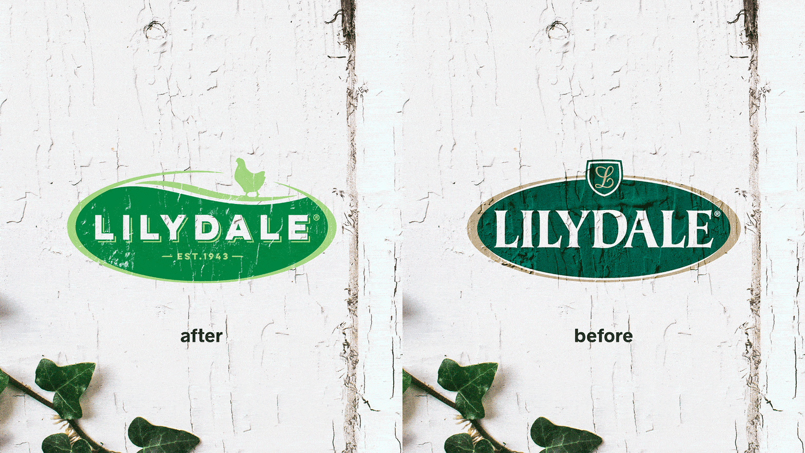
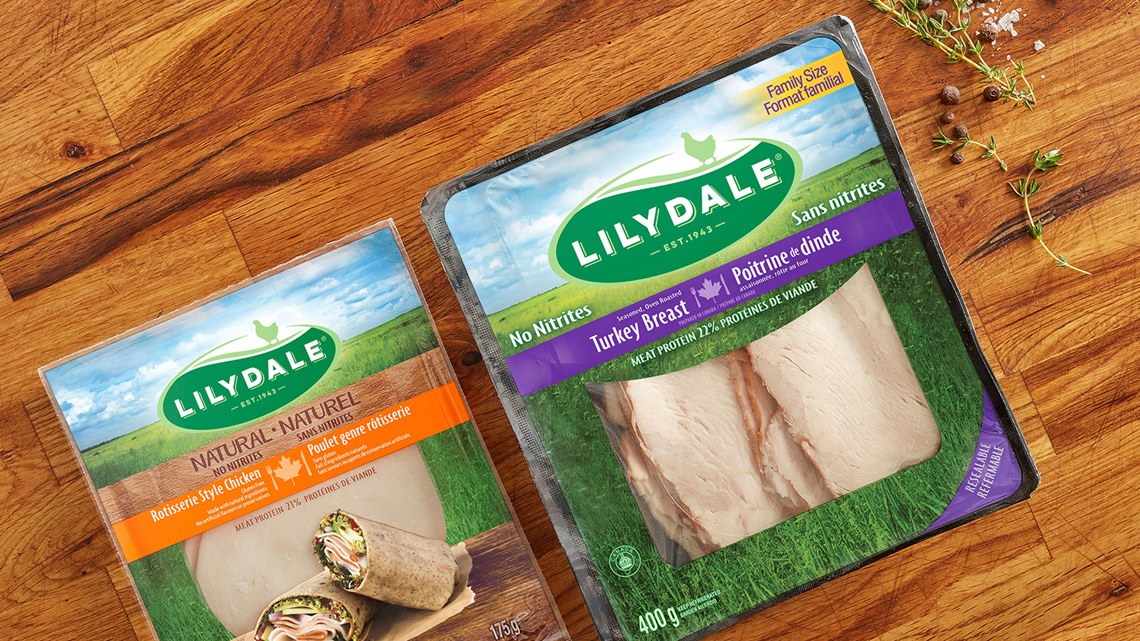
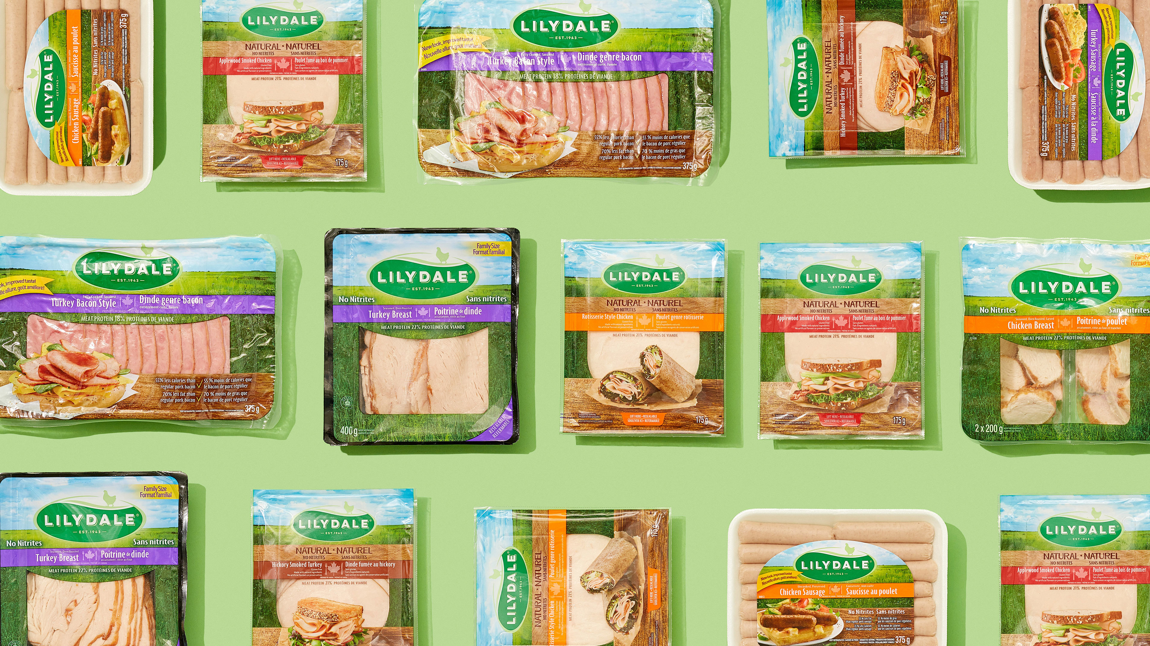
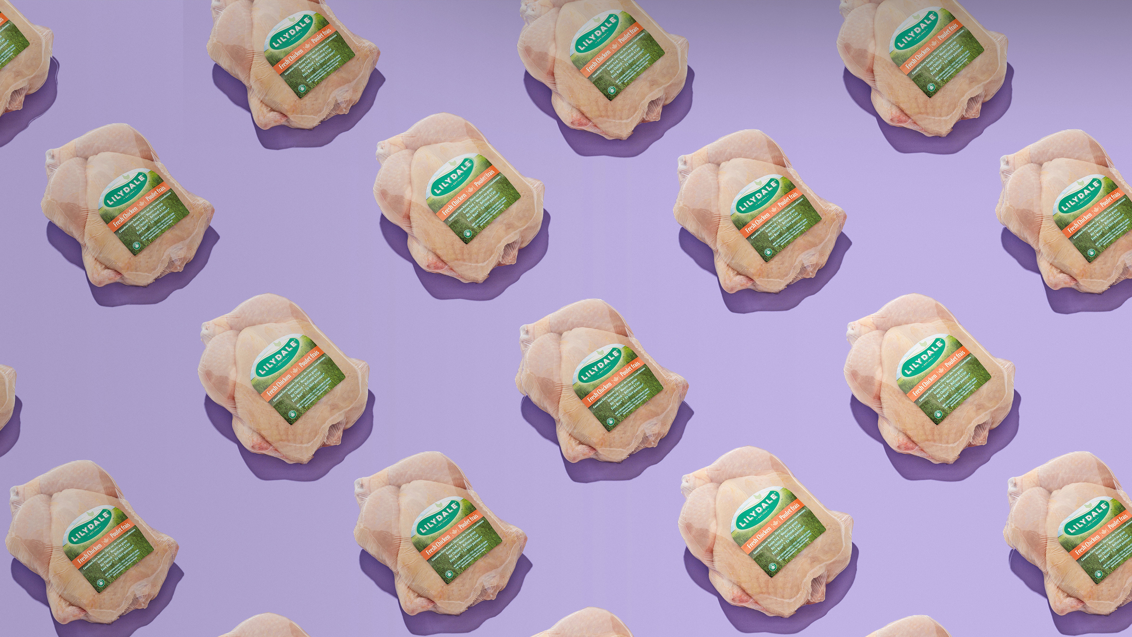
Lilydale has a heritage of providing quality to consumers. But in today’s health-conscious world, we needed to revitalize the brand and breathe some farm-fresh air into the category. The logo was redesigned to mirror the brand’s original core values of heritage and quality, but with a palette that exuded freshness. Packaging followed suit, making the bright blue skies and grassy pastures at home on the family farm synonymous with Lilydale for shoppers nationwide.
What we did:
Brand Design, Package Design, Retail, Shopper Marketing
