By: Robyn Cambruzzi
Simple is hard. Everything in moderation. The best things in life are free. Mo money, mo problems. Less is more. With so many paradoxes putting minimalism on a pedestal, it’s become second nature to reject the idea that sometimes more is just the right amount.
Mosaic's own Design Director, and self- proclaimed minimalist, Robyn Cambruzzi examines the design world's greatest divide: minimalism vs. maximalism.
In a world where brands are always trying to one-up each other, be the most human, the most visible, and the most loved, things can get pretty ugly. Case in point, maximalism.
It may fit the bill of industry buzzword or millennial slang, but the term ‘Maximalism’ was actually used to describe literary works over a century ago.
Maximalism first appeared in the visual arts in the 1960s and 70s, with artists like Dieter Roth presenting works that profoundly rejected the visual fundamentals of minimalism. While minimalism is the simplification of form and color, maximalism is precisely the opposite, an abundance of color and texture. These are the opposing philosophies of “less is more” and “more is more.”
‘Less is more’ is engrained into the minds of twenty-first century designers from the onset of their education and repeated throughout their careers. Echoed by professors and creative directors alike, “less is more” has become the roadmap to which designers ought to navigate their craft. At its best, the result is an Apple product. At its worst, it’s cliché hipster poster art featuring Helvetica set in black and white (designers insert eye roll emoji here).
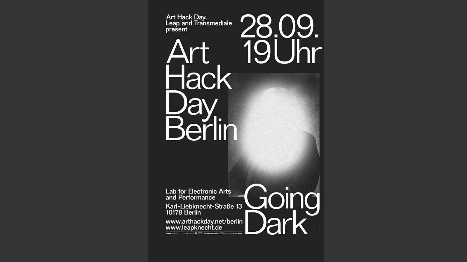
But a decade-long period of widespread Scandinavian minimalism has created a (literal) chasmal whitespace in our world. Predictably, designers and artists are advancing on this empty canvas trying to make a name for themselves by filling it with expressive, anti-minimalist works, giving shape to the current trend of maximalism across the arts.
A growing number of visual artists are choosing to use an eclectic approach like @KahindeWiley and @HattieStewart.
Both artists use complex thematic patterns in their work to create visual tension. The resulting chaotic environments confront viewers with an array of concepts and emotions.
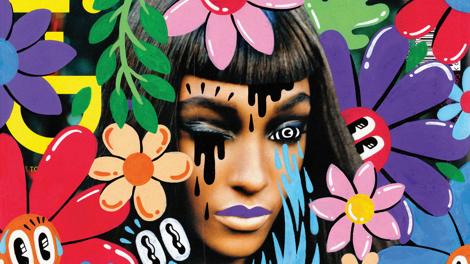
Image By: Hattie Stewart
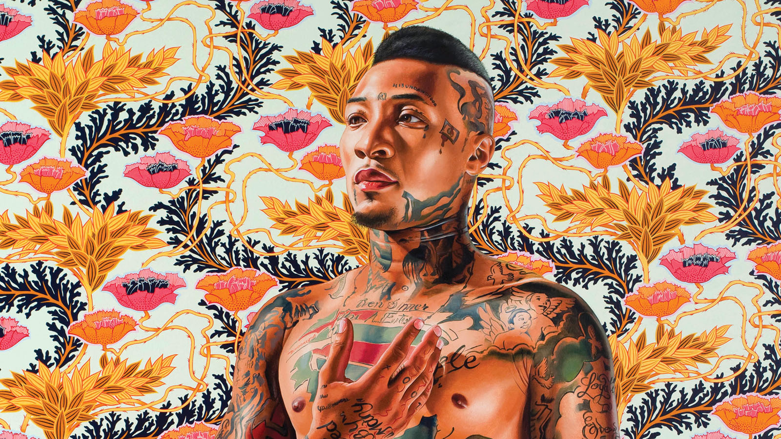
Image By: Kahinde Wiley
In fashion, designers such as Versace, Gucci, and Moschino have been staunch supporters of loud patterns and textures for years, but in 2018, they’ve taken this devotion to the extreme. Fashion lovers and stylists worldwide are filling their shopping bags to the max, and high fashion maximalism has trickled down to mainstream retailers like H+M and Zara.
Earlier this year, maximalism was coined a top trend in interior design, too. Even Ikea temporarily swapped their Scandic-style, for a partnership with artist Per B Sundberg and the creation of their new FÖREMÅL collection; featuring playful vases, canine candle holders, textiles and more. Although the collection has not received widespread love, it begs the questions: can marketers learn something from this? Is a brand more successful if you either love it or hate it? Is it better to be polarizing than ordinary? After all, at its core, isn’t the job of a brand designer to make consumers feel? Arguably, minimalist branding and design can lack personality and emotion, but does this mean that maximalism is the way to a consumer's heart?
One brand who has embraced maximalist advertising design is Dropbox. This time last year they launched their new branding. It features a multitude of contrasting colors, a font family of 259+ weights, and equally as diverse illustration styles — and it certainly ruffled a few feathers within the design community.
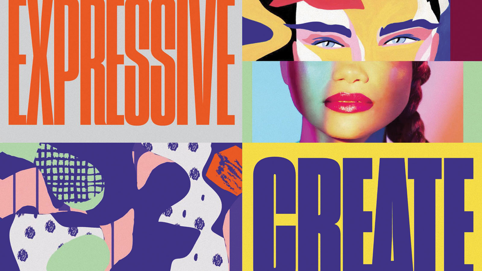
The idea behind their new advertising design system was “co-creation: artists joining forces to tell a story.” Unfortunately for Dropbox, this statement has largely been critiqued as inauthentic for a brand which ultimately provides an online portal to store and share documents. However, the overall essence of creativity and diversity has certainly been achieved. Personally, I find the identity intriguing. Some of the design elements can feel a bit disjointed at times, but at the very least it’s unique.
One thing that is for sure, the concept of maximalism is polarizing. Love it or hate it, it makes a statement. At its best, maximalism is dynamic, immersive, and most importantly distinctive. At its worst, it's confusing. My advice to brands looking to incorporate maximalism is to take calculated risks. What is the message your brand is trying to convey? Would maximalism be an authentic venture? Does it speak to your target audience? Does it reflect your brand positioning? If your brand is a retirement home, the answer is no. A tech startup? Maybe. A new nightclub? Absolutely. Just ensure every design decision you make has intention. Fonts, colors, and patterns often narrate a brand's story even louder than its words.